Print/Publication
NUVO Magazine, Vol. 11, No. 1
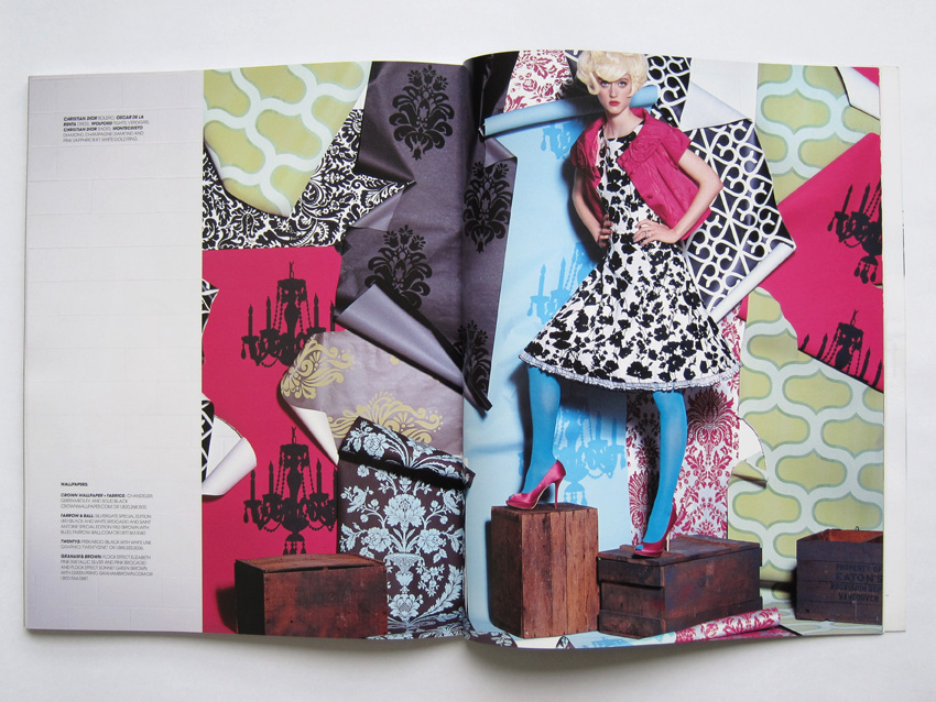
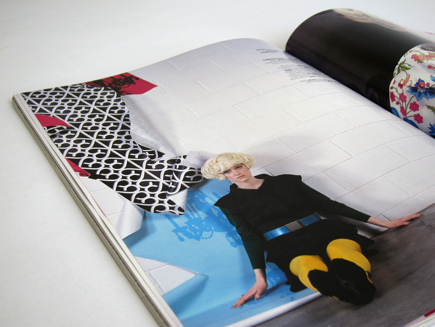
Art direction, design and creative direction of photo shoots for NUVO Magazine, a quarterly Canadian lifestyle publication dedicated to delivering editorial content that is stimulating, evocative, entertaining and informative. The magazine targets affluent, educated men and women with a wide range of topics on travel, business, architecture, design as well as celebrity profiles and fashion editorials. As an Art Director for NUVO, Sandra has redefined publication’s visual style and established design principles that are consistent with the character of the magazine.
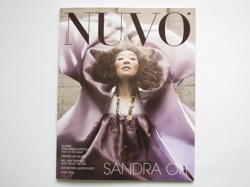
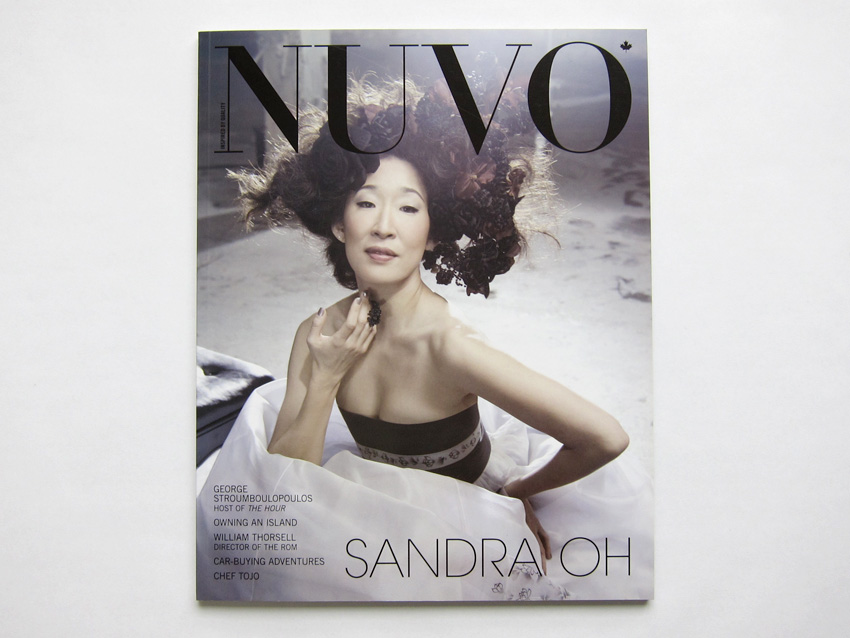
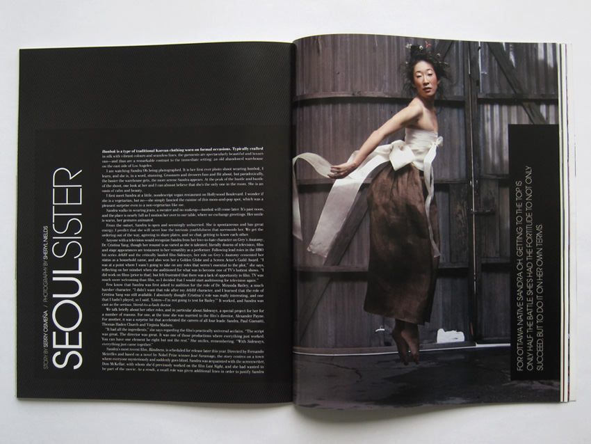
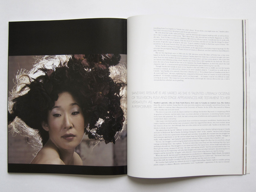
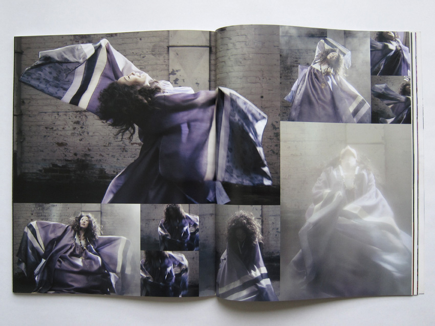
Sandra is a true believer that the creation of a strong and unique image is a result of a collaborative process. She carefully chooses a team of people who share the same values and an understanding that the project is an equal opportunity for all involved to be creative. There is nothing more gratifying then partaking in a collaborative creative energy in order to reach a common goal. A testament to this is an ethereal portrait of actress Sandra Oh that graces the award winning cover of NUVO’s Spring 2008 issue. A cyclone of fabric envelopes her face while soft lighting creates an atmospheric mood. Sandra Oh is wearing Hanbok, traditional Korean clothing, crafted specifically for the shoot and reminiscent of her heritage. Photographed by Sheryl Nields at a gritty warehouse on the east side of Los Angeles, the immediate setting is a startling contrast to the luxurious fabrics of the garments. Sandra Oh’s serene beauty and inner strength are apparent in the photos. In each image she is telling a story, and each captures her determination to always be her own authentic self. In the opening spread, vertical title in white colour on a black background accentuates Sandra Oh’s upward position on the facing page. Inside the article, a spread composed of images varying in size depict Sandra Oh as she moves across the floor, immersed in her own world.
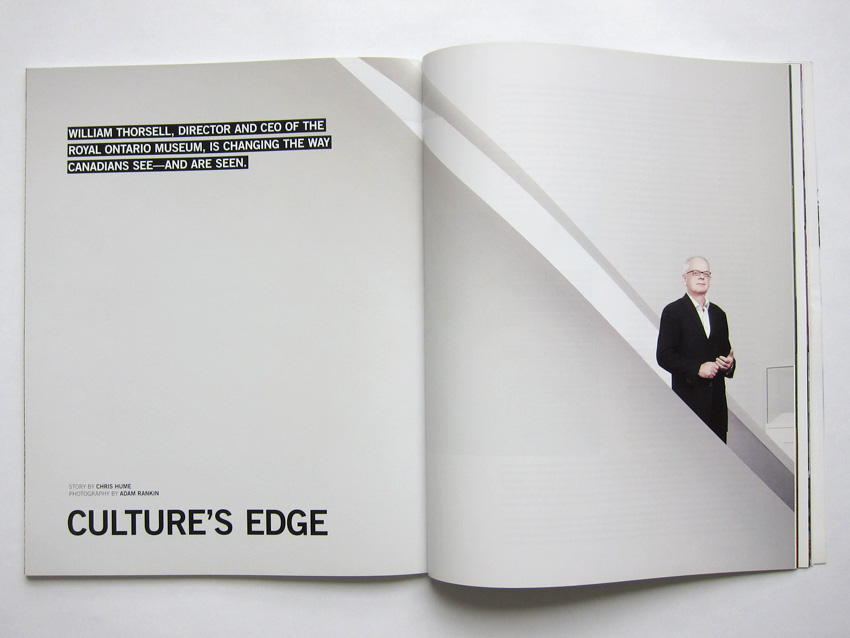
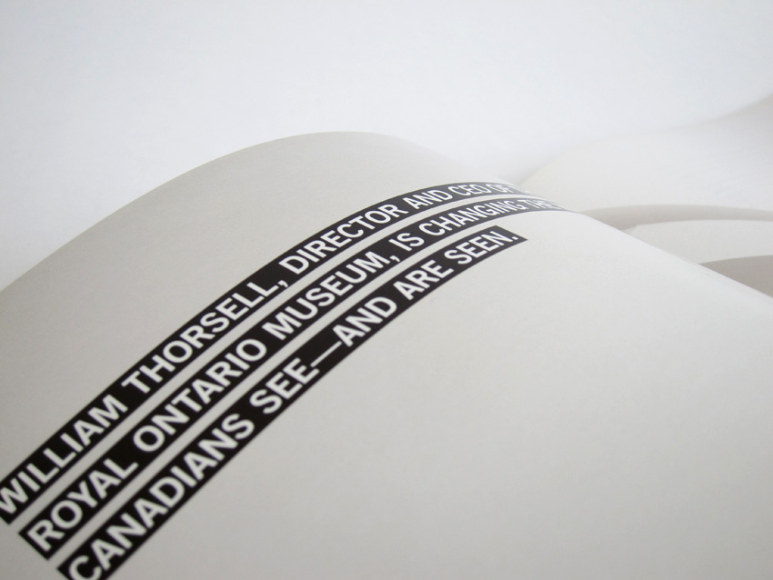
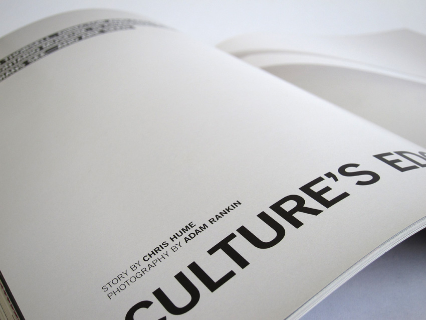
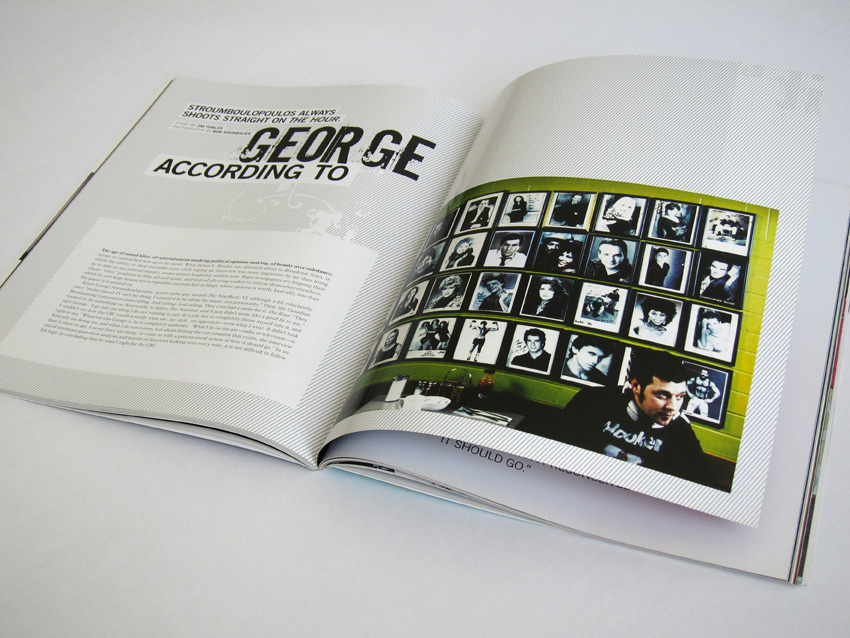
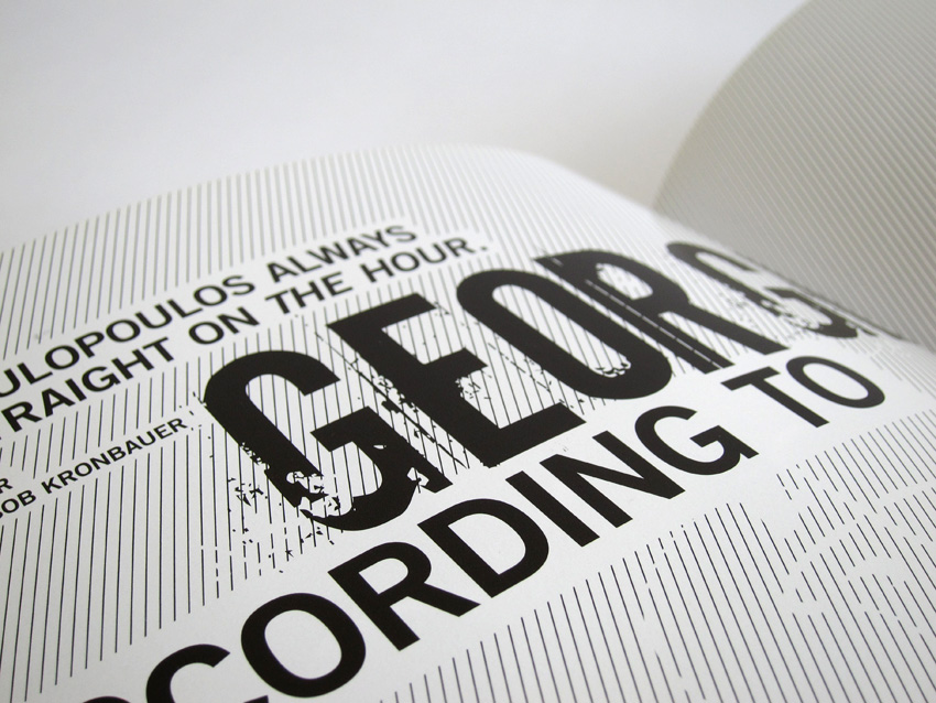
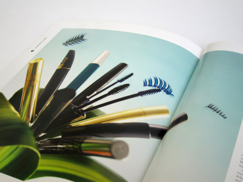
In feature articles, Sandra approached each subject with a deep understanding and adopted design accordingly to reflect the subject’s unique character. It was only appropriate to apply a minimalist aesthetic to the layout design for a profile of William Thorsell, Director and CEO of the Royal Ontario Museum. The opening spread utilizes museum’s bare walls as the backdrop, not only against which Thorsell is photographed by Toronto based, Adam Rankin, but also against which a bold title and captions are arranged. The result is simple and sophisticated, resembling both the ROM and its director. An article on unconventional star of a Canadian Broadcast Show The Hour, George Stroumboulopoulos, called for some liberties with design: distressed type was used to set his name apart and provide more character, line art formed the background and simple cut-and-paste treatment was used for the title and the captions. A candid portrait on the opening spread, taken by Vancouver based photographer, Bob Kronbauer, shows George being just that—George, as authentic as he is in all situations, conversing over breakfast at a local joint. For this issue’s Looking Good department, Vancouver based photographer, Clinton Hussey, produced a stunning shot of mascara arranged into a flower, with luscious eyelashes posing as butterflies.
_____