Identity
NUVO Magazine
NUVO Magazine is a quarterly Canadian lifestyle publication dedicated to delivering editorial content that is stimulating, evocative, entertaining and informative. The magazine targets affluent men and women with a range of articles about travel, business, architecture, design, entertainment as well as celebrity profiles and fashion editorials. As an Art Director for NUVO, Sandra has redesigned the magazine to make it more relevant to contemporary culture, and an existing identity needed to be revitalized to express the new vision for the publication.
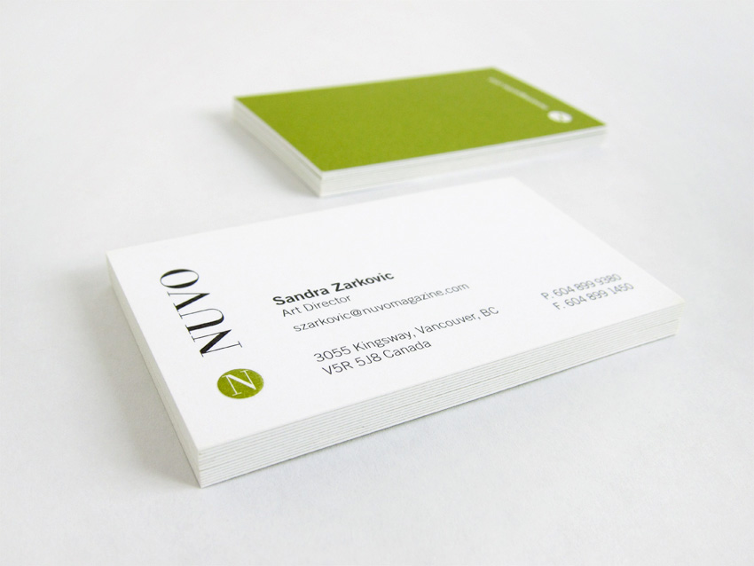
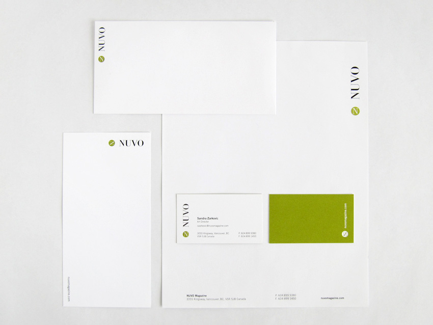
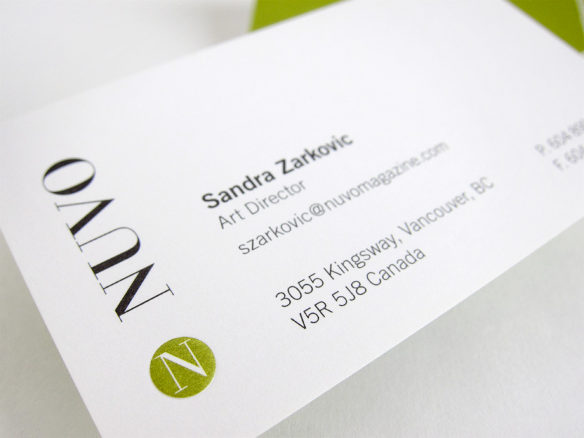
Sandra's challenge was to refine the logo keeping its original character but insuring that it would function well when applied to all types of materials. The new logo came out of the development of the magazine. Sandra designed a simple, straightforward icon, in the form of a monogram of the publication’s initial letter contained within a circle to give it greater presence in visually active environments. The simplicity of the shape together with the vibrancy of the green color signals the modern and forward thinking nature of the publication, while the serif typeface used for the initial lends a note of sophistication and elegance. In the magazine the icon is used to draw attention to the department labels and to mark the end of the article.
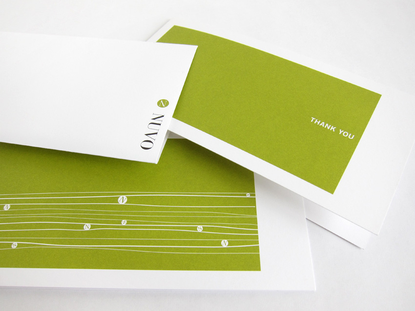
For the logotype, Sandra used an existing typeface, Bodoni, for its refined and elegant demeanor, and to sustain brand recognition. A secondary typeface, Trade Gothic, was introduced for the body copy in stationary and various literature items, as well as headlines and decks in the magazine. This simple sans serif font acts as a counterbalance to the more ornamental forms of the Bodoni typeface. In addition to the identity, Sandra designed a full range of applications, including stationary, print collateral and marketing materials.
_____