Identity
Quince Culinary
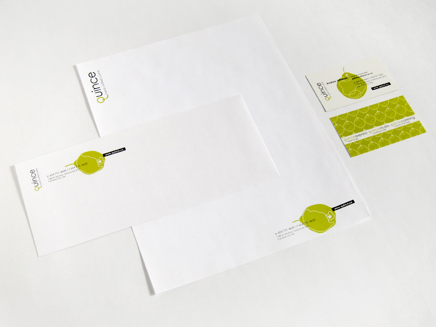
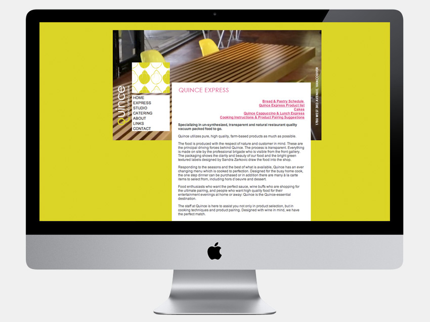
Logotype, identity system, stationery, packaging, print collateral, ad templates and website design for a Vancouver based café, boutique food shop and cooking school. An ultimate gourmet destination, Quince Culinary is committed to the use of high quality local and sustainable ingredients with slow cooking methods to create a beautiful contemporary cuisine. Sandra was asked to capture and project the company’s unique character. The client needed an identity that was simple yet memorable, a visual language that would speak to the active, urban and upscale customer in a distinctive contemporary fashion.
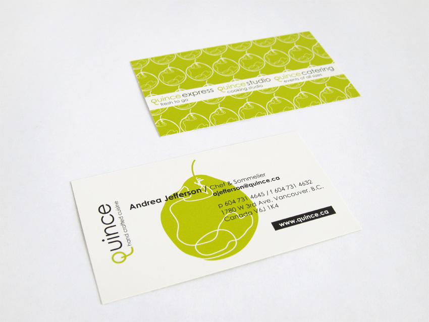
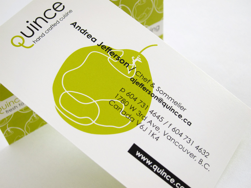
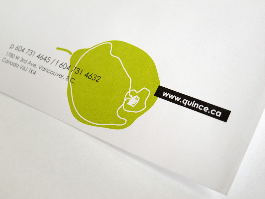
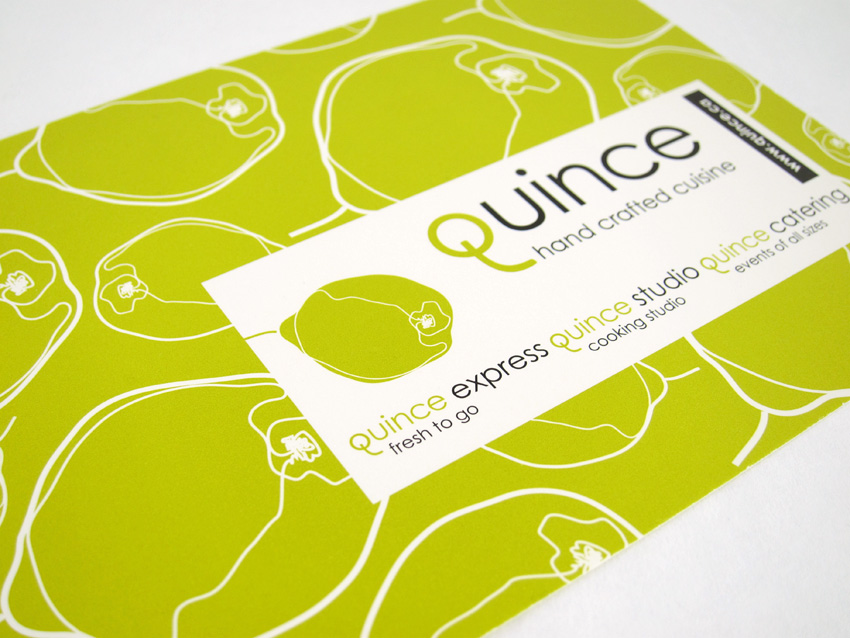
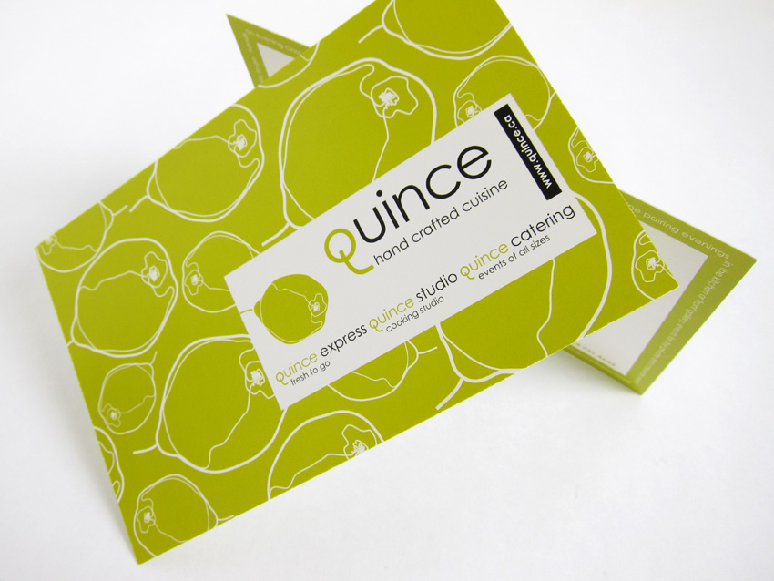
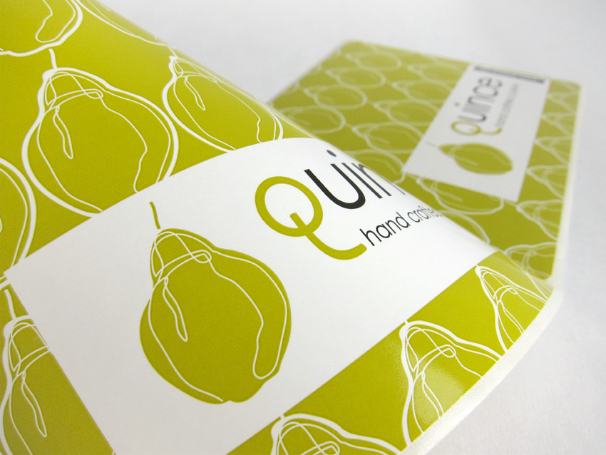
Sandra’s solution was a simple logotype that emphasizes the “q” with a custom designed letterform at the beginning of a delicate line of sans-serif typography, creating a point of distinction for the logo. The green color for the “q” was selected because of its connection to quince fruit as well as to nature and environment. To complement the simplicity of the logotype and reflect the artisan quality of the cuisine, Sandra developed a collection of line drawings illustrating the fruit in varying angles. The line art was combined to create an elegant and eclectic series of patterns in the identity system, that was used in a variety of applications from labels and signage to the website, reflecting the company’s multifaceted nature.
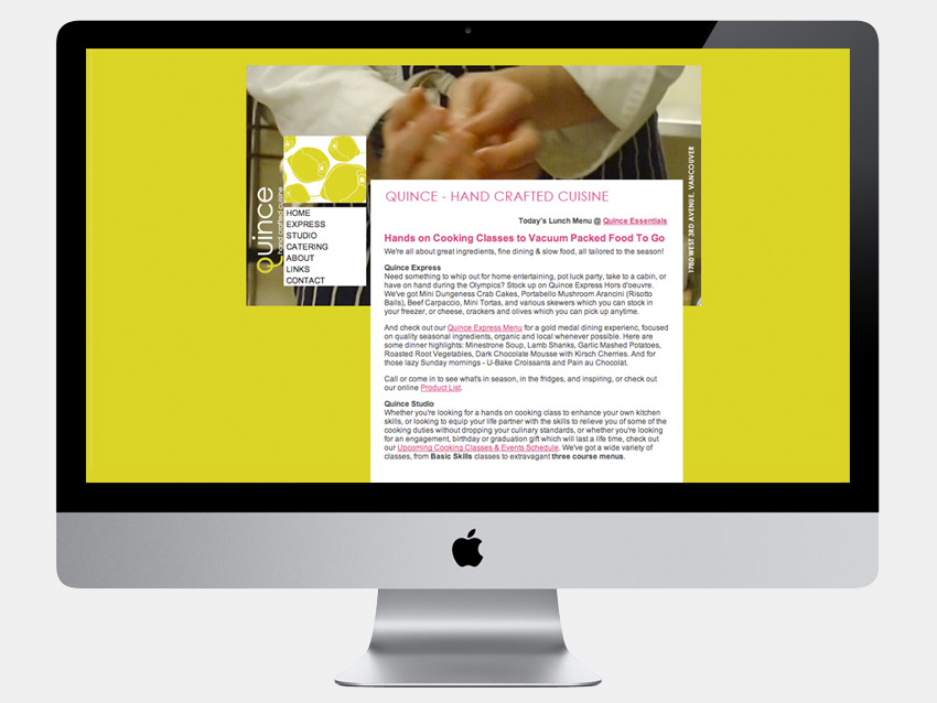
The packaging for the high-quality vacuum packed food needed to be flexible, allowing for a title and a short description to be applied in house on as needed bases. To accommodate this, Sandra devised a system of labels with dynamic and engaging patterns that display well on different surfaces and can be utilized for various packaging needs such as boxes, clear vacuum and plastic bags. For the design of the company’s website Sandra used large photographs as a backdrop against which simple navigation, text and additional graphic elements are arranged to effectively project the brand’s unique personality.
_____